Get Support
123-456-789-10
SpecksDesk
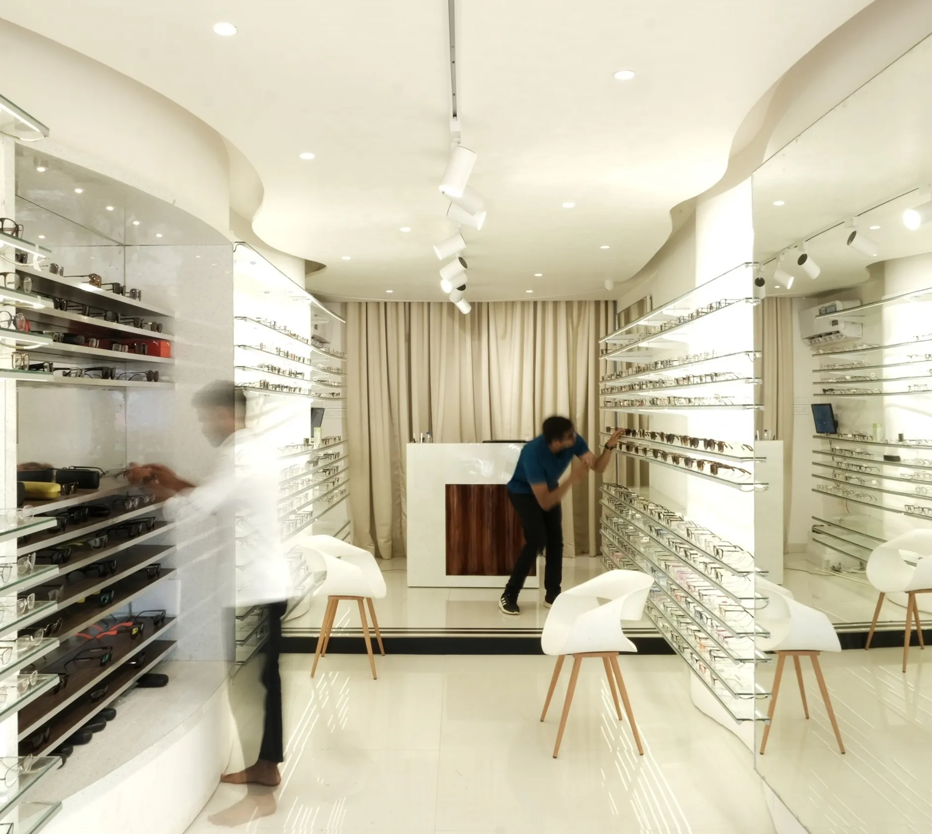
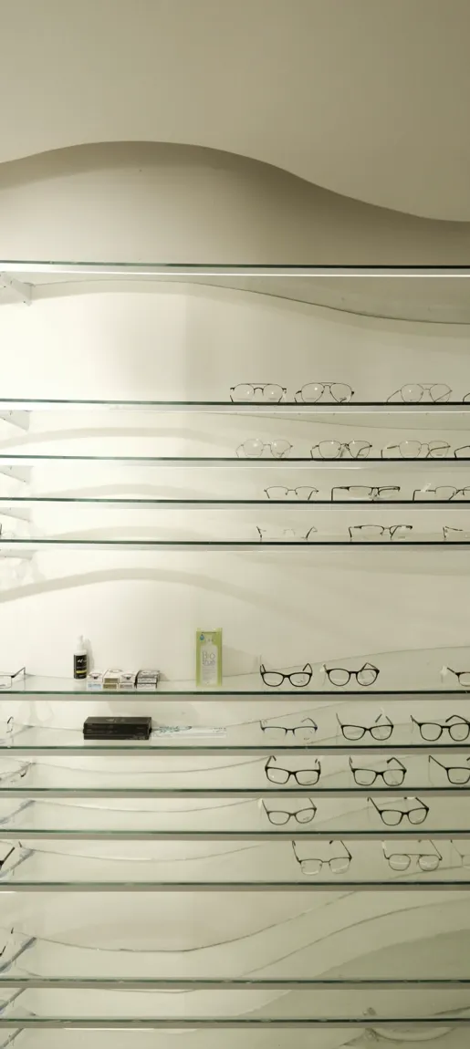
The optical store focuses on making sunglasses the star attraction. The interior is charechterized by fluidity and movement, achieved through curved display units that weave through the space. Neutral tones provide a backdrop, allowing the sunglasses to stand out, accentuated by lighting.
Branding In Interior Design
The vision of the eyewear brand was to bring dynamic eyewear designs that are not just for the present but the future too.
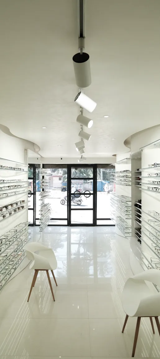
The space required to be designed was a narrow long space. It needed to be broken down into smaller sections. The futuristic vision of the brand as well as the requirement of the space gave rise to the introduction of curves in the design. The curves broke the homogeneity of the space as well as it created pockets for displaying different ranges of eyewear. It guides the movement of the user.
Movement being an element of futurism, is also a metaphor for forward motion.
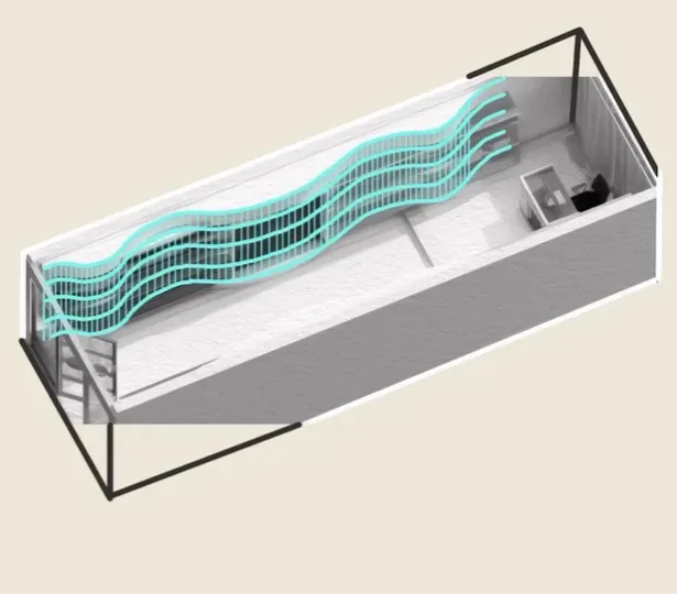
Central Axis /Balance
At the central axis, the billing desk takes a deliberate departure from this fluidity. It provides a counterbalance to the dynamic surroundings, creating a sense of stability and order
This intentional contrast ensures that customers intuitively identify the transaction area, while also serving the functional need of a flat, stable surface essential for efficient transactions.
Placement at the central axis enhances accessibility, making it a focal point for both customers and staff.
Visual Merchandising & Consumer Behaviour.
Our research on Visual merchandising and impact on consumer behaviour , aimed to create a storefront that captures the interest of those passing by
The customers are enticed with a door handle which resembles a ‘spectacle’ . the use of glass partition, compels them to step inside where the immersive visual experience unfolds. The store handle is Modern materials like glass and metal used, contribute to a sophisticated aesthetic

.png)

